If you want to be kept up to date with new articles, CSS resources and tools, join our newsletter.
Whether you like your entire OS to be in dark mode or not, sometimes it's just nice to dim an application and gives your eyes a little rest. That's exactly what dark mode in Polypane, one of our most requested features, gives you.
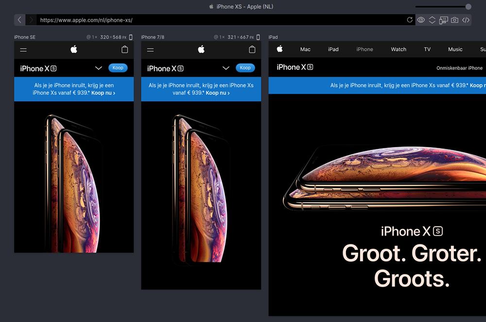
No more bright flashes
With dark mode, switching from your code editor, IDE or terminal to Polypane will be less jarring and disruptive. Dark mode will turn on automatically for macOS users who have dark mode enabled, and for everyone else it's just a matter of toggling using cmd-i or ctrl-i.
Complete reworking of the UI colors
The Polypane dark mode is a complete recoloring of the UI using css custom properties and with it, support for multiple color schemes. Depending on your feedback, we'll look to add a high contrast mode or even customisable themes. Let us know what you'd like to see!
Try out Dark mode in Polypane and give your eyes some relief.

